.png)
2.png)
.png)
2.png)
In the final design, the text wraps around the pictures, and text is connected, showing the contrast from the pictures, and the titles are in bold.
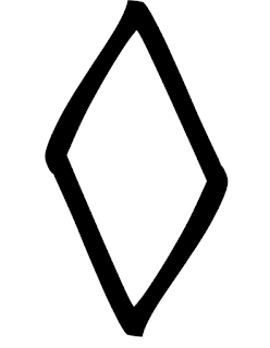
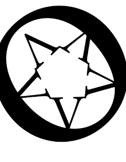
For the first one, there is similarity as putting one letter upside down and connecting both make a diamond shape.The second is figure and ground as it is enclosed in an o.
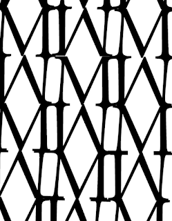
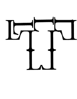
The third is continuity as the M's are in a line and copy each other since I lined them together like that to make the pattern. The fourth is closure as it makes a shape that makes another. I moved the L's sideways and inverted them.
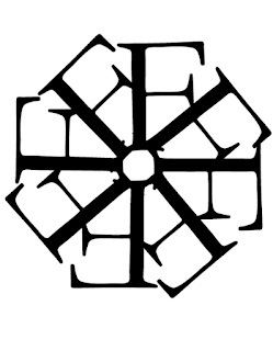
The last one is proximity as it is F's to make a circle and combined in the center.
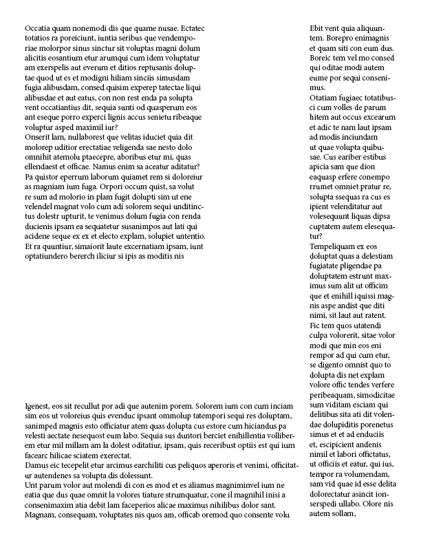
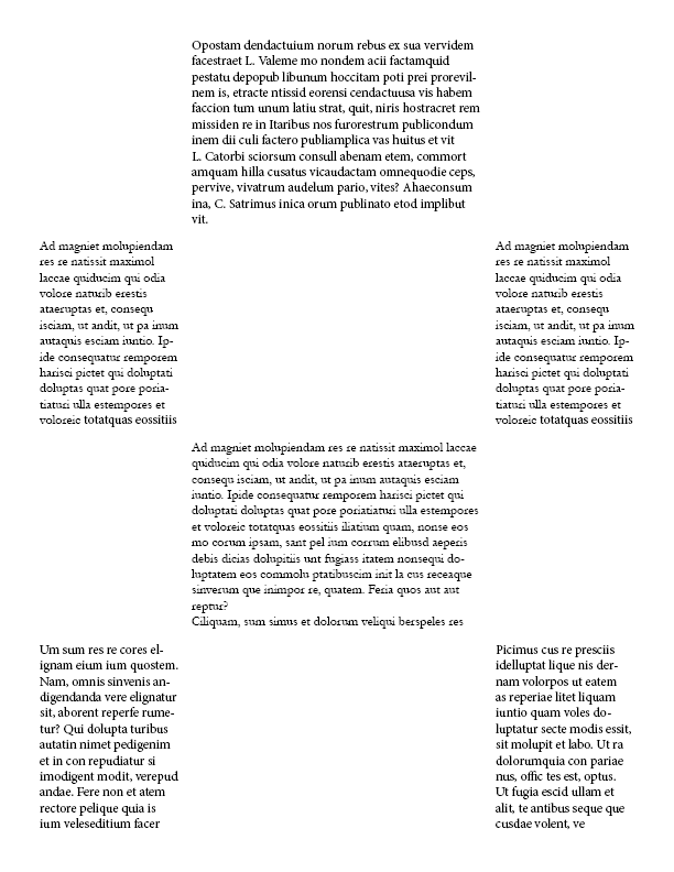
The first image has a main point with the text on one side and the other text surrounding it. With the second one showing the placement of the text and evening it out.
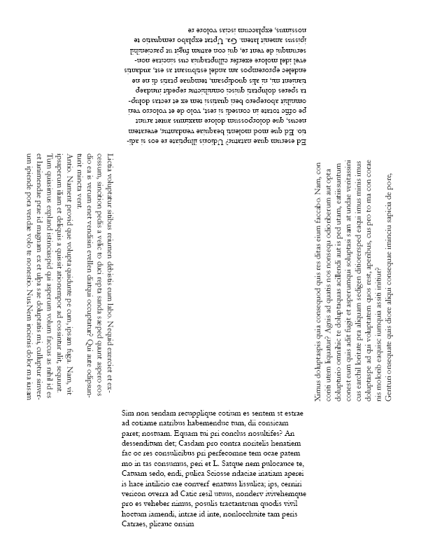
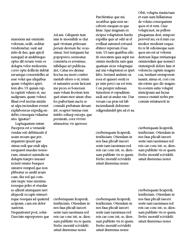
The third is like a box circle but is empty on the corners and in the middle and shows the placement of the text in many ways. The fourth one shows order between the text and shows shape to make like a fist-type picture.
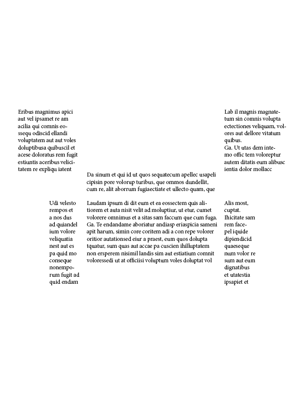
The last one is a creeper face from Minecraft which shows the text in the shape of the face and the order of the text.